Saturday, April 23, 2011
Windrose
A Windrose is a type of map that shows information about the wind at a particular location over a specified time period. The frequency of the winds are plotted by wind direction. The different colors show the wind ranges. In this particular map, one can see the color bands that show the different wind ranges.
Link: http://www.google.com/imgres?imgurl=http://climate.met.psu.edu/features/PA_WIND_ROSES/windroses.PNG&imgrefurl=http://climate.met.psu.edu/features/PA_WIND_ROSES/windrose.php&usg=__JAVsDAwQrecM5zjB1qQLmGQOtag=&h=723&w=993&sz=111&hl=en&start=0&zoom=1&tbnid=pdVcqx_0UhO1mM:&tbnh=136&tbnw=187&ei=j02zTcjLCrOJ0QHinMW2CQ&prev=/search%3Fq%3DWindrose%2Bmap%26um%3D1%26hl%3Den%26sa%3DN%26biw%3D1280%26bih%3D588%26tbm%3Disch&um=1&itbs=1&iact=hc&vpx=519&vpy=95&dur=2990&hovh=191&hovw=263&tx=101&ty=163&page=1&ndsp=20&ved=1t:429,r:2,s:0
Triangular Plot
A Triangular Plot shows data in an easy way of seeing the information, a triangle. There are usually three sets of data being shown. In this picture, you can see three different parties within Great Britain's political system: Labour Party, the Conservative Party and the Liberal Democrat Party.
Link: http://www.google.com/imgres?imgurl=http://www.ex-parrot.com/~chris/tmp/talk-2004-06-15/end-of-2003.png&imgrefurl=http://www.ex-parrot.com/~chris/wwwitter/20050407-it_doesnt_matter_how_you_vote_either_way_your_planet_is_doomed.html&usg=__fkRdvkEKCxDVQ8YzYKl_Ko-iH0c=&h=627&w=653&sz=41&hl=en&start=0&zoom=1&tbnid=Sf0A22Ny39_0iM:&tbnh=127&tbnw=132&ei=qkyzTbeCDYjV0QGCxZSWDw&prev=/search%3Fq%3DTriangular%2Bplot%26um%3D1%26hl%3Den%26biw%3D1280%26bih%3D588%26tbm%3Disch&um=1&itbs=1&iact=hc&vpx=911&vpy=255&dur=111&hovh=220&hovw=229&tx=90&ty=116&page=1&ndsp=21&ved=1t:429,r:12,s:0
Correlation Matrix
In a Correlation Matrix two sets of data are compared and a relationship is established. It also helps to determine how well something correlates. This particular matrix is on trading on Wall Street and it shows the correlation between trades.
Link: http://www.google.com/imgres?imgurl=http://kurtosistrading.com/blogspot/wp-content/uploads/2010/01/matrix.png&imgrefurl=http://kurtosistrading.com/blogspot/%3Fp%3D770&usg=__dDYK9hwXYNKMAXGc1u4UvqU8o90=&h=712&w=1416&sz=280&hl=en&start=76&zoom=1&tbnid=dxzDYJyuzHDloM:&tbnh=82&tbnw=163&ei=A0yzTYjHBYWltwe7ypjqDg&prev=/search%3Fq%3DCorrelation%2Bmatrix%26um%3D1%26hl%3Den%26sa%3DN%26biw%3D1280%26bih%3D588%26tbm%3Disch0%2C1871&um=1&itbs=1&iact=hc&vpx=539&vpy=322&dur=139&hovh=159&hovw=317&tx=160&ty=101&page=5&ndsp=19&ved=1t:429,r:15,s:76&biw=1280&bih=588
Link: http://www.google.com/imgres?imgurl=http://kurtosistrading.com/blogspot/wp-content/uploads/2010/01/matrix.png&imgrefurl=http://kurtosistrading.com/blogspot/%3Fp%3D770&usg=__dDYK9hwXYNKMAXGc1u4UvqU8o90=&h=712&w=1416&sz=280&hl=en&start=76&zoom=1&tbnid=dxzDYJyuzHDloM:&tbnh=82&tbnw=163&ei=A0yzTYjHBYWltwe7ypjqDg&prev=/search%3Fq%3DCorrelation%2Bmatrix%26um%3D1%26hl%3Den%26sa%3DN%26biw%3D1280%26bih%3D588%26tbm%3Disch0%2C1871&um=1&itbs=1&iact=hc&vpx=539&vpy=322&dur=139&hovh=159&hovw=317&tx=160&ty=101&page=5&ndsp=19&ved=1t:429,r:15,s:76&biw=1280&bih=588
Similarity Matrix
Similarity Matrix is a matrix of data that shows similarity between two sets of data.The blue line area shows the least similar, while the red shows the most similar.This matrix is of behavioral analysis clustering.
Link: http://www.google.com/imgres?imgurl=http://cgi.mtc.sri.com/Cluster-Lab/01.jpg&imgrefurl=http://cgi.mtc.sri.com/Cluster-Lab/&usg=__c0xfgUY4BTTjh9JGHuHLUKrTAOE=&h=388&w=504&sz=82&hl=en&start=0&zoom=1&tbnid=qy75M8y5Ve7KSM:&tbnh=125&tbnw=163&ei=OEqzTf7NMYrL0QGlwYQQ&prev=/search%3Fq%3DSimilarity%2Bmatrix%26hl%3Den%26sa%3DX%26biw%3D1280%26bih%3D588%26tbm%3Disch%26prmd%3Divns&itbs=1&iact=hc&vpx=542&vpy=124&dur=20&hovh=197&hovw=256&tx=129&ty=92&page=1&ndsp=20&ved=1t:429,r:3,s:0
Climograph
A Climograph shows the monthly precipitation and temperature conditions for a particular place in a graphical way. The graph shows the climate of Manaus, Brazil.
Link: http://www.google.com/imgres?imgurl=http://www2.volstate.edu/kbell/BrazilClim.jpg&imgrefurl=http://www2.volstate.edu/kbell/climographs.htm&usg=__ABCjvayrwyVRTCE0l10V0eA7ORQ=&h=587&w=561&sz=68&hl=en&start=0&zoom=1&tbnid=YbYoE3yoPGAIbM:&tbnh=136&tbnw=130&ei=fEmzTe__B8fc0QHDl7WpCg&prev=/search%3Fq%3DClimograph%26um%3D1%26hl%3Den%26sa%3DN%26biw%3D1280%26bih%3D588%26tbm%3Disch&um=1&itbs=1&iact=hc&vpx=874&vpy=226&dur=64&hovh=230&hovw=219&tx=117&ty=153&page=1&ndsp=18&ved=1t:429,r:10,s:0
Stem and Leaf Plot
A Stem and Leaf Plot allows for many different numbers to be seen easily. The first set of numbers is the stem and the second set is the leaf. The stem and leaf plot allows for many numbers to be written in a small space.
Link: http://www.google.com/imgres?imgurl=https://onlinecourses.science.psu.edu/stat200/sites/onlinecourses.science.psu.edu.stat200/files/lesson01/stem_and_leaf.jpg&imgrefurl=http://onlinecourses.science.psu.edu/stat200/turning/graphs&usg=__LzsIYVuvMpOUdOlcoFBpze6umOI=&h=234&w=192&sz=9&hl=en&start=0&zoom=1&tbnid=1AskYepvDjEVNM:&tbnh=125&tbnw=112&ei=t0izTcHpLIqU0QGt-5mSCQ&prev=/search%3Fq%3Dstem%2Band%2Bleaf%2Bplot%26hl%3Den%26sa%3DX%26biw%3D1280%26bih%3D588%26tbm%3Disch%26prmd%3Divns&itbs=1&iact=rc&dur=252&page=1&ndsp=21&ved=1t:429,r:13,s:0&tx=25&ty=65
Link: http://www.google.com/imgres?imgurl=https://onlinecourses.science.psu.edu/stat200/sites/onlinecourses.science.psu.edu.stat200/files/lesson01/stem_and_leaf.jpg&imgrefurl=http://onlinecourses.science.psu.edu/stat200/turning/graphs&usg=__LzsIYVuvMpOUdOlcoFBpze6umOI=&h=234&w=192&sz=9&hl=en&start=0&zoom=1&tbnid=1AskYepvDjEVNM:&tbnh=125&tbnw=112&ei=t0izTcHpLIqU0QGt-5mSCQ&prev=/search%3Fq%3Dstem%2Band%2Bleaf%2Bplot%26hl%3Den%26sa%3DX%26biw%3D1280%26bih%3D588%26tbm%3Disch%26prmd%3Divns&itbs=1&iact=rc&dur=252&page=1&ndsp=21&ved=1t:429,r:13,s:0&tx=25&ty=65
Box Plot
A Box Plot is a way of depicting groups or data in which there are quartiles.The box plot shows the distribution of the plots. One can see the actual box. This allows for easy identification.
Link: http://www.google.com/imgres?imgurl=http://support2.dundas.com/OnlineDocumentation/webchart2005/ChartType_Images/BoxPlot.png&imgrefurl=http://support2.dundas.com/OnlineDocumentation/webchart2005/BoxPlotChart.html&usg=__-LxlCQyQTDzmz9VFidoWM1xgF0I=&h=325&w=400&sz=52&hl=en&start=0&zoom=1&tbnid=YXVO9KUt_NN3fM:&tbnh=128&tbnw=158&ei=sEezTf7fLsHa0QHox7T6CA&prev=/search%3Fq%3DBox%2Bplot%26um%3D1%26hl%3Den%26sa%3DN%26biw%3D1280%26bih%3D588%26tbm%3Disch0%2C178&um=1&itbs=1&iact=rc&dur=213&page=1&ndsp=19&ved=1t:429,r:8,s:0&tx=73&ty=46&biw=1280&bih=588
Population Profile
A population profile is a profile that shows a decrease and increase in ages.In this example, it shows a population profile for the Arab Emirates.
Link: http://www.populationaction.org/Publications/Reports/The_Shape_of_Things_to_Come/Chapter_Six_Subtypes_and_a_Speculative_Structure.shtml
Scatterplot
A Scatterplot puts in points for each of the items being tested so that the viewer may see a positive or negative correlation. In this Scatterplot, the author wanted to show how a tower mounted wind turbine power performance testing.
Link: http://www.windtesting.com/prototypetesting.html
Index Value Plot
The Index Value Plot shows either a positive or negative value as compared to the index value which is often zero.In this particular example, you can see the index value at zero and how the La Nina and El Nino compare to this index value.
Link: http://images.google.com/imgres?imgurl=http://www.skepticalscience.com/images/soi_2003_2008.gif&imgrefurl=http://www.skepticalscience.com/What-causes-short-term-changes-in-ocean-heat.html&usg=__7AiBJPKtfNrIeOkm4Gh0n2Imhoc=&h=311&w=450&sz=12&hl=en&start=6&sig2=SnyA1Sg6TdO1i--BAuaoNw&um=1&itbs=1&tbnid=UAmyjvR6zeDaHM:&tbnh=88&tbnw=127&prev=/images%3Fq%3Dsouthern%2Boscillation%2Bindex%26um%3D1%26hl%3Den%26client%3Dsafari%26sa%3DN%26rls%3Den%26tbs%3Disch:1&ei=2AnSS-e7I8P98Aasg-2sDw
Accumulative Line Graph
An accumulative line graph or Lorenz curve is a map that plots the cumulative distribution of the amount of the variable concerned against the cumulative frequency distribution
Link: http://people.hofstra.edu/geotrans/eng/ch4en/meth4en/img/gini.gif
Link: http://people.hofstra.edu/geotrans/eng/ch4en/meth4en/img/gini.gif
Bilateral Graph
This is an example of a Bilateral Graph. A Bilateral Graph shows two variables and how they interact with each other on one single axis.
Link: http://www.energytribune.com/articles.cfm/676/Green-Energy-Advocate-Amory-Lovins-Guru-or-Fakir
Link: http://www.energytribune.com/articles.cfm/676/Green-Energy-Advocate-Amory-Lovins-Guru-or-Fakir
Nominal Area Choropleth Map
A Choropleth Map is a thematic map which the areas are shaded or patterned in proportion to the measurement of the statistical variable being displayed on the map. A Nominal Area Choropleth Map is where the categories that are displayed are arbitrary.
Link: http://ddc.aub.edu.lb/projects/archaeology/berytus44/maps/Middle_East98.html
Unstandardized Choropleth Map
A Choropleth Map is a thematic map which the areas are shaded or patterned in proportion to the measurement of the statistical variable being displayed on the map. An Unstandardized Choropleth Map shows the data in a non-ranked method.
Link: http://pubs.usgs.gov/fs/2005/3051/images/2000choropleth.gif
Standardized Choropleth Map
A Choropleth Map is a thematic map which the areas are shaded or patterned in proportion to the measurement of the statistical variable being displayed on the map.A Standard Choropleth Map shows data aerially with divisions or borders to separate it. It will give the data in some type of unit that is usually averaged out.
Link: http://www.statcan.gc.ca/pub/92f0138m/2008003/figures/5200001-eng.htm
Univariate Choropleth Map
A Choropleth Map is a thematic map which the areas are shaded or patterned in proportion to the measurement of the statistical variable being displayed on the map. A Univariate Choropleth Map shows only one set of data.
Link: http://www.cartisan.com/map_resources/map_types/images/choropleth.jpg
Bivariate Choropleth Map
A Choropleth Map is a thematic map which the areas are shaded or patterned in proportion to the measurement of the statistical variable being displayed on the map.A Bivariate Choropleth map displays only two variables on a single map by combining two different sets of symbols.
Link: http://eost.u-strasbg.fr/omiv/barcelo_area_landslide_hazard.html
Unclassed Choropleth Maps
A Choropleth Map is a thematic map which the areas are shaded or patterned in proportion to the measurement of the statistical variable being displayed on the map. An Unclassed Choropleth Map does not classify the data. It simply shows the different colors for each aerial unit.
Link: https://blogger.googleusercontent.com/img/b/R29vZ2xl/AVvXsEgG41zL5I2TfCW2yLYDyiDG9X9l51guNrGHJ_XDb4x8aSDanpu9dyQldjYwga9MAGrAZm-i3UNx_Jmxu4GT6a_9Hbb_cUvuAKbfYLEqeo4bTtQkcwr6XiG_UbPlrvoWvqOCwvQYGJEibv0/s1600/24.gif
Classed Choropleth Map
A Choropleth Map is a thematic map which the areas are shaded or patterned in proportion to the measurement of the statistical variable being displayed on the map.A Classed Choropleth Map is a particular type of Choropleth Map that uses smaller intervals to portray the data. The data is broken down and assigned colors.
Link: http://personal.uncc.edu/lagaro/2101/2101_ProjectsS2001/beefmethaneJMK.gif
Range Graded Proportional Circle Map
A Range Graded Proportional Circle Map is different than a proportional circle map in it that depicts the circles in relation to ranges of data.In this map it shows the different locations compared to one another.
Link: http://4.bp.blogspot.com/_b_Fy-HKi1ks/STfcbpmgJAI/AAAAAAAAAHw/dEpRC6_r0ko/s1600-h/Range_graded_proportional_circle_map.gif
Continuously Variable Proportional Circle Map
Continuously Variable Proportional Circle Map is a proportional circle map that uses scales. This is how it differs from a Proportional Circle Map.
Link: http://mapmaker.rutgers.edu/355/dotProporCircle.jpg
Digital Orthophoto Quadrangles (DOQQ)
This map is of a Digital Prthophoto Quadrangle (DOOQ),which is a computer-generated image of an aerial photograph in which image displacement caused by terrain relief and camera tilts has been removed.
Link: http://www.dnr.sc.gov/GIS/descdoqq.html
Digital Elevation Model
A Digital Elevation Model is a three-dimensional model that shows depth and height to a geographic location.
Link: http://www.google.com/imgres?imgurl=http://www.geo.cornell.edu/geology/classes/Geo101/graphics/ithaca_dem.jpg&imgrefurl=http://www.geo.cornell.edu/geology/classes/Geo101/101week2_f05.html&usg=__3L990qW5RMmKnAiyCWwQcTGQQ7w=&h=2716&w=3042&sz=989&hl=en&start=0&zoom=1&tbnid=Khwd9K3HpMo_5M:&tbnh=136&tbnw=152&ei=XDWzTY3qIOHo0gGG7IyvCQ&prev=/search%3Fq%3DDEM%26um%3D1%26hl%3Den%26sa%3DN%26biw%3D1280%26bih%3D588%26tbm%3Disch&um=1&itbs=1&iact=hc&vpx=519&vpy=269&dur=802&hovh=212&hovw=238&tx=132&ty=145&page=1&ndsp=19&ved=1t:429,r:15,s:0
Digital Line Graph
A Digital Line Graph contains digital vector data representing cartographic information. This map shows data for Beaufort, South Carolina.
Link: http://www.dnr.sc.gov/GIS/descdlg.html
DRG Map
A DRG map is a digital raster graphic, which is a special form of mapping. This map is of the State of Missouri and is a U.S. Geological Survey (USGS) standard series topographic map.
Link: http://msdis.missouri.edu/data/drg/images/drg-index-map.jpg
Tuesday, April 19, 2011
Isohyets
This is an example of an Isohyets. These maps show a line on a map connecting places having equal rainfall. This particular Isohyets is of the United States.
Isotachs
This is an example of an Isotachs. Isotachs shows lines in a given surface connecting points with equal wind speed. This particular one is of North and South Dakota.
Link: http://www.erh.noaa.gov/btv/events/28Oct2008/ua2.php
Isobars
This is an example of an Isobar Map. Isobars are lines of equal atmospheric pressure that do not cross or touch and follow atmospheric pressure in millibars. They show high and low pressure systems.
LIDAR Map
Doppler Radar
This is an example of a Doppler Radar showing South Florida. The red coloring is severe thunderstorms, while the green is less severe.
Link: http://www.profilforum.no/lytebox/florida-weather-radar-loop.html
Black and White Aerial Photograph
This picture is a Black and White Aerial Photograph of an airport in Boston. These photographs are very detailed in that they have high pixel resolution.
Link: http://www.expertgps.com/screenshots.asp
Infrared Map
This picture is an example of an Infrared Map in that it picks up different types of landscape and buildings by a reflection of light and heat. The agriculture fields can be seen as the bright red colors. These are often used for environmental issues.
Cartographic Animation
This is an example of a Cartographic Animation allows information to be easy for the viewer to understand. In this case, for individuals to understand the severity of a particular hurricane, a well-defined eye of a hurricane is a large key to its severity.
Link: http://www.google.com/imgres?imgurl=http://www.hurricanekatrina.com/images/hurricane-katrina-category-5.jpg&imgrefurl=http://www.hurricanekatrina.com/&usg=__zb45AgaUmiQRd3B5d8_8qufgBzc=&h=479&w=550&sz=51&hl=en&start=0&zoom=1&tbnid=hcLS_wVreYIq1M:&tbnh=134&tbnw=148&ei=wVeuTYWVMKbz0gGjh8iGAQ&prev=/search%3Fq%3Dhurricane%26um%3D1%26hl%3Den%26biw%3D1280%26bih%3D617%26tbm%3Disch&um=1&itbs=1&iact=rc&dur=339&oei=wVeuTYWVMKbz0gGjh8iGAQ&page=1&ndsp=18&ved=1t:429,r:5,s:0&tx=68&ty=83
Statistical Map
Link: http://gcaptain.com/who-has-the-oil-a-map-of-world-oil-reserves?534
Isoline Map
This picture is of a Isoline Map. It shows the mean precipitation in Mexico. It shows the average mean in the different cities.
Link: http://www.lib.utexas.edu/maps/atlas_mexico/mean_annual_precipitaion.jpg
Proportional Circle Map
This is an example of a Proportional Circle Map. Minard showed the proportion of different types of meat that were sent to Paris butcheries from different regions in France. The circles and symbols estimate the volume of meat that came from different regions.
Link: https://www.e-education.psu.edu/geog486/l5_p5.html
Choropleth Map
This particular map is a Choropleth Map that shows the different ration and data values for density populations for the Hispanic community within the United States The darkest value shows the highest population density.
Hypsometric Map
This is an example of a digital Hypsometric Map which shows elevation by the differing of the shading and coloring. The map is of the Agean Sea, particularly the island of Kos.
Link: http://www.reliefshading.com/colors/hypsometric.htm
Link: http://www.reliefshading.com/colors/hypsometric.htm
Monday, April 18, 2011
PLSS Map

This is an example of a PLSS Map that shows Franklin County in relation to the entire state of Alabama. The Franklin Township can be seen in blue.
Link: http://www.rootsweb.ancestry.com/~alfrankl/landrecords.htm
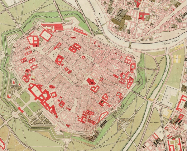
Cadastral Map

Link: http://www.fig.net/hsm/news/franz/1829wien_600.jpg
Thematic Map

This is an example of a Thematic Map, which shows the soil moisture regimes in the United States. The different colors show the difference in soil. You can see a light blue color for the coastal lines on the southern east coast, which differs from the light green color of the other southern states.
Link: http://soils.usda.gov/use/thematic/images/drought_1_gen_area_map.jpg
Topographic Map

This is a Topographic Map of the country of Ukraine, showing the different features of the land make up. This allows the viewer to have a better overall idea of the land composition of the country.
Link: http://www.world-geographics.com/maps/europe/topographic-map-of-ukraine/
Planimetric Map

This map is an example of a Planimetric Map. It shows the international boundary lines of Iraq, its major cities, roads, railroads, airfields, seas, rivers and lakes. It also shows the oil refineries within the country.
Link: http://www.google.com/imgres?imgurl=http://egsc.usgs.gov/nimamaps/graphics/K341SIraqRefgra_th.jpg&imgrefurl=http://egsc.usgs.gov/nimamaps/topo.html&usg=__GmIY3bZKkCgLa1vfPQgKEaodjyY=&h=338&w=312&sz=51&hl=en&start=0&zoom=1&tbnid=Q_2BiY2258epBM:&tbnh=133&tbnw=123&ei=Qe-sTZLQAo_UgAfutZD-DA&prev=/search%3Fq%3DPlanimetric%2Bmap%26um%3D1%26hl%3Den%26sa%3DN%26biw%3D1259%26bih%3D597%26tbm%3Disch&um=1&itbs=1&iact=rc&dur=213&oei=Qe-sTZLQAo_UgAfutZD-DA&page=1&ndsp=18&ved=1t:429,r:4,s:0&tx=49&ty=64
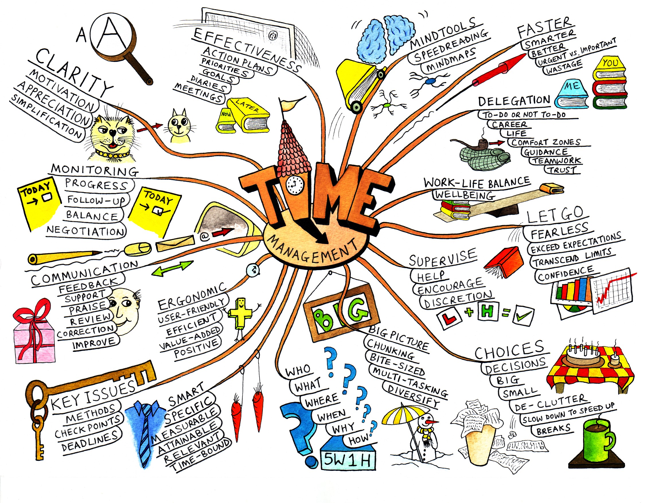
Mental Map

This is an example of a Mental Map that reflecting an individual's ability to manage their time and the various components that are attributed to it.
Link: http://www.mindtools.com/pages/article/newISS_01.htm
Cartogram Map

This Cartogram Map shows the 2003 world consumption rate of natural resources by country. A Cartogram Map is a map which has some thematic mapping variable. The geometry of the map is distorted so that the information can be seen clearly.
Link: http://lamarguerite.files.wordpress.com/2007/11/cartogram.gif
Flow Map

This is an example of a Flow Map. This map shows the number and direction of refugee movement out of Iraq and into the numbering countries of Jordan, Egypt, Lebanon, Turkey, Syria and Iran.
Link: http://news.bbc.co.uk/2/hi/6998372.stm
Star Plot

This is a Star Plot Map, which shows the distance and location of stars in space in relation to our sun. The sun is located in the middle and is orbited by different stars. The plot shows the closest thirty stars to the sun and it shows a multi-dimensions relationship. All of these stars lie within about thirteen light years of the earth.
Link: http://lifeng.lamost.org/courses/astrotoday/CHAISSON/NAV/FRAMESET/FRAME17/IDX17-01.HTM
Dot Distribution
A dot distribution differentiates by varying the shapes or colors of the points. This map depicts the spread and distribution of ".com" websites. It shows how the ".com" websites are more prominent on the East Coast and near the Silicon Valley. In this particular dot distribution, the brighter the color or the more dots that are closely lined together, the heavier the distribution of ".com" websites.
Link: http://www.google.com/imgres?imgurl=http://463.blogs.com/.a/6a00d8341ccff353ef013481ff83db970c-800wi&imgrefurl=http://463.blogs.com/the_463/webtech/&usg=__pw-KZQmDQvy98ptxxKHeJgMpCn4=&h=447&w=800&sz=35&hl=en&start=89&zoom=1&tbnid=jLrLSksM97r6RM:&tbnh=115&tbnw=205&ei=3eOsTZiCNOuP0QHi3pC7Cw&prev=/search%3Fq%3DDot%2Bdistribution%2Bmap%26hl%3Den%26biw%3D1259%26bih%3D625%26site%3Dsearch%26tbm%3Disch&um=1&itbs=1&iact=rc&dur=267&oei=R-GsTYe8A8XpgAert_3_DA&page=6&ndsp=18&ved=1t:429,r:9,s:89&tx=149&ty=68
Subscribe to:
Posts (Atom)


